Originthink: A Casual Display Font That Elevates Digital Branding
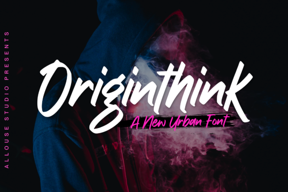
I was halfway through refining the hero section of a boutique online store’s new product landing page when I paused—again—to test Originthink. Not for its technical specs, but for how it *felt*: warm, approachable, urban without trying too hard. The client wanted something that reflected their handmade ceramics line—thoughtful, tactile, quietly confident—and this display font landed differently than the usual geometric sans serifs I reach for first.
Originthink has that rare balance: casual enough for Instagram story text or a wedding invitation graphic, yet structured enough to hold weight in a responsive hero headline. Its letterforms carry subtle rhythm—slight tapering on verticals, open counters, and gentle contrast—not so much “designed” as “lived-in.” It reads like a well-curated playlist: familiar, intentional, never loud. As a display font, it’s not built for paragraphs. But for short bursts of meaning? A tagline over a muted photo background. A section header above a testimonial carousel. A bold CTA button on a course sales page—it shines.
In practice, I dropped Originthink into three key areas of the landing page: the main headline (“Handmade in Portland”), a subheading (“Ceramics Designed for Daily Ritual”), and the primary button (“Shop the Collection”). On desktop, it created instant visual hierarchy—no extra spacing or sizing tweaks needed. On mobile, I adjusted tracking slightly (+20) and bumped the font size by 4px for clarity, but the core readability held. No squinting. No double-takes. Just clean, confident presence—even over a textured image overlay.
That’s where Originthink earns its place in real digital work: it doesn’t compete with your content, it frames it. Unlike some script or handwritten fonts that demand attention (and sometimes sacrifice legibility), Originthink supports scanning behavior. Users glance, absorb, move forward—exactly what you want in a fast-scrolling environment. It feels human, not algorithmic. And because it’s designed for modern UI contexts, it scales cleanly across devices without hinting artifacts or fuzzy rendering.
I tested it across several common web scenarios:
- Portfolio homepage: Used for the name in the top-left logo lockup—paired with Inter for body copy. The contrast felt editorial but friendly, like a design magazine cover.
- Coaching website: Applied to the “What You’ll Gain” section headers—small caps version added polish without stiffness.
- Digital brand kit: Included as the recommended display option for social media banners and email headers. Its consistent x-height and spacing made templates feel cohesive across platforms.
- Blog redesign: Reserved for post titles only—never body text—and paired with a warm, low-contrast serif (like Literata) for an inviting, magazine-like flow.
Readability is always contextual, and Originthink responds well to thoughtful treatment. Over dark backgrounds? Crisp at 24px and up. On light backgrounds with subtle noise textures? Still clear, especially with modest letter-spacing. For buttons under 18px, I switched to the regular weight (not bold)—it preserved shape without crowding. And crucially, it performed reliably in WebKit, Chromium, and Firefox—no fallback surprises in production.
Font pairing matters just as much as the font itself. With Originthink, I consistently reached for neutral, highly legible sans serifs—Inter, Manrope, or even system fonts like -apple-system—for body text and navigation. That contrast lets the display font breathe while keeping interfaces scannable and accessible. If your brand leans more editorial—say, a literary newsletter or independent publisher—you could pair it with a refined serif like Cormorant Garamond for headings and a relaxed sans for UI elements. The goal isn’t harmony at all costs; it’s intentionality.
Before committing to any display font in a live project, I check three things: webfont availability, licensing clarity, and stylistic range. Originthink ships with multiple weights (Light, Regular, Bold), true italics, and OpenType features—including alternate characters and ligatures that add quiet personality without clutter. It supports Latin-based languages out of the box, and the WOFF2 files are lean (<60KB total), so no meaningful impact on LCP or CLS. And yes—it’s a commercial font with clear licensing for websites, SaaS dashboards, and digital templates. No gray-area “personal use only” clauses.
One thing I appreciated during implementation: the font’s natural rhythm meant fewer manual kerning adjustments. In Figma, I used auto-kerning for headlines and only fine-tuned two pairs (“To”, “Av”) for consistency. In CSS, I applied font-feature-settings: "kern" and kept font-optical-sizing: auto enabled—small touches that let the type do its job without intervention.
It’s easy to overlook how much typography shapes perceived trust. A rushed or mismatched font can make even a beautifully coded site feel provisional. Originthink avoids that trap. It’s polished but not sterile, distinctive but not distracting. When a small business owner sees their brand name rendered in Originthink—clean, grounded, quietly expressive—they don’t just see a font. They see a version of their voice, translated into visual language that works across screens, contexts, and moments of attention.
So if you’re choosing a display font for your next landing page, portfolio, or digital brand kit—ask yourself: does it support the message, or does it ask for attention instead? With Originthink, the answer is refreshingly simple: it serves.