Moqarin: A Bold Display Font That Elevates Digital Branding
It started with a hero section that felt… safe. Too safe. I was redesigning a landing page for a small creative coaching practice—clean layout, thoughtful spacing, strong imagery—but the headline just didn’t land. It read like every other service page on the web. So I opened my font library and scrolled past the usual suspects until Moqarin caught my eye.
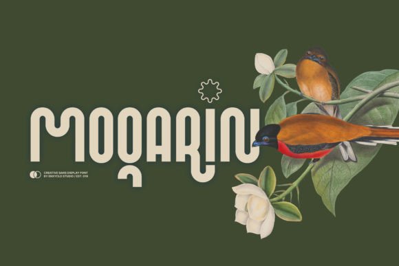
Moqarin is a display font with presence. Not loud, not chaotic—but confidently condensed, with sharp terminals, subtle contrast, and a rhythm that feels both intentional and human. It’s designed to shine at large sizes—think 48px and up in a hero headline or banner—but what surprised me was how well it held up at 24px in a mobile navigation label or even 18px as a subtle section divider. Its boldness doesn’t rely on weight alone; it’s built into the structure. That complexity gives it texture without sacrificing clarity.
I dropped Moqarin into three key spots: the main headline (“Clarity Starts Here”), a short subheading (“One-on-one creative coaching for designers and founders”), and a CTA button (“Book Your Session”). Instantly, the hierarchy tightened. The headline pulled attention—not because it was huge, but because Moqarin made it feel *designed*, not just typed. The subheading stayed legible thanks to generous letter spacing and open apertures, and the button gained quiet authority without needing extra padding or shadow effects.
That’s where Moqarin shines in real digital work: it strengthens visual hierarchy without demanding more UI real estate. On a portfolio homepage, it gave project titles gravitas over full-bleed images. On a boutique online store’s seasonal banner, it added craft and intentionality next to hand-drawn icons and soft photography. Even in a course sales page, where trust and credibility matter most, Moqarin lent editorial polish to section headers like “What You’ll Build” and “Your First Module”—making the content feel curated, not templated.
Readability? Yes—it works. But with nuance. On light backgrounds, Moqarin breathes easily. Over muted image overlays (like a 20% black gradient), it stays crisp—especially when paired with modest tracking (+40–60 units at larger sizes). On dark mode or deep charcoal backgrounds, I increased line-height slightly and softened the contrast of surrounding text to keep focus on the Moqarin-driven moments, not the entire paragraph.
Mobile responsiveness was smooth—but only after testing. At under 20px, Moqarin’s condensed nature starts to compress visual rhythm. So I set a simple CSS rule: font-size: clamp(1.5rem, 4vw, 3.5rem); for headlines. That kept it expressive on desktop, balanced on tablet, and still legible—even charming—on smaller screens. No micro-adjustments needed beyond that.
Font pairing is where Moqarin becomes truly versatile. I paired it with Inter for body copy—clean, neutral, highly readable—and the contrast elevated both. For a more editorial brand kit, I tested it with IBM Plex Serif, and the result felt grounded yet distinctive. The key is balance: Moqarin carries personality, so supporting type should support—not compete. Avoid other decorative or high-contrast fonts nearby. Let Moqarin be the voice; let your body font be the conversation.
It’s not a font for paragraphs. Or captions. Or form labels. And that’s by design. Moqarin thrives in short, intentional bursts: headlines, logos (as wordmarks), section titles, social media banners, email headers, digital ad copy, and branded graphics. In a blog redesign, I used it only for the site name in the header and post titles—never for bylines or pull quotes. That restraint made each appearance feel deliberate.
Before deploying, I checked the technical details—because real projects depend on them. Moqarin includes multiple weights (Light, Regular, Bold), true italics, OpenType features like stylistic alternates and ligatures, and solid multilingual support covering Latin Extended-A and basic Cyrillic. It’s available as WOFF2 for fast web loading, and the license covers commercial use across websites, client projects, SaaS dashboards, and digital templates. No surprises. No last-minute swaps.
One thing I appreciated during implementation: Moqarin doesn’t require heavy optimization tricks. It loads quickly, renders consistently across Chrome, Safari, and Firefox, and respects system font fallbacks gracefully. When the font fails to load (rare, but possible), the fallback sans serif maintains hierarchy—just without the same character. That reliability matters when you’re shipping for clients or launching a campaign.
Using Moqarin reminded me why display fonts still matter in an age of minimalist UIs: they’re one of the few remaining tools that communicate tone *before* a single word is read. It’s not about decoration—it’s about signaling intention. A coaching site using Moqarin says, “We take creative growth seriously.” A product landing page says, “This isn’t generic—it’s crafted.” A portfolio says, “My work has point of view.”
It won’t fix weak content. It won’t compensate for poor spacing or inconsistent color. But when placed thoughtfully—in service of clarity, brand voice, and user intent—it adds polish that feels earned, not applied. That’s the difference between a layout that functions and one that resonates.
If you’re choosing a display font for your next web project, ask yourself: does it strengthen what users need to see first? Does it reflect the tone your audience expects—not just what looks trendy? Does it hold up across devices, contexts, and loading conditions? Moqarin passed all three. And now, every time I see that condensed ‘M’ or the confident curve of its ‘R’, I remember the moment a safe headline became something unmistakably its own.