Giant Universe: A Futuristic Display Font for Digital Design
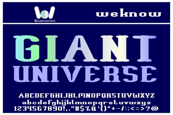
As a UI designer who builds landing pages, SaaS dashboards, and conversion-focused e-commerce experiences, I look for display fonts that do more than just look striking—they need to reinforce brand tone, guide the eye, and hold up across devices. Giant Universe delivers exactly that: a clean, high-contrast, geometric display font with subtle sci-fi elegance and strong visual authority.
Its letterforms balance sharp angles with smooth curves—think compact uppercase glyphs, tight spacing, and confident vertical stress. It’s not overly ornate, nor is it cold or sterile. That makes Giant Universe unusually versatile for digital use: bold enough for hero section headlines, refined enough for premium apparel branding, and distinctive enough to anchor a game studio’s web presence or an indie music label’s online store.
Where Giant Universe Shines in Web Layouts
In real-world projects, I reach for Giant Universe when I need instant hierarchy without sacrificing clarity. It works exceptionally well in:
- Hero sections: Paired with ample whitespace and a minimal sans serif body font (like Inter or Manrope), it creates immediate focus on value propositions—ideal for course sales pages or product launch sites.
- Landing page CTAs: Used sparingly on primary buttons (“Get Early Access”, “Join the Beta”), its futuristic energy subtly signals innovation—without undermining trust.
- Branded banners and digital ads: On social media carousels or email headers, Giant Universe stands out at small sizes (down to 24px) thanks to its generous x-height and open counters.
- Portfolio and creative agency sites: When showcasing work for film, gaming, or editorial clients, it adds tonal cohesion—especially over dark-mode backgrounds or gradient overlays.
- Online shop headers and collection titles: In boutique stores selling apparel or limited-edition merch, it conveys exclusivity while remaining legible on mobile thumbnails.
Readability & Responsiveness: Practical Considerations
Giant Universe is designed as a display font—not a text face—so I never use it for paragraphs, navigation labels, or form fields. But within its intended scope, it performs reliably across viewports. On mobile, I cap usage at 32px for headings and avoid tight line heights (<1.1) to preserve glyph separation. Over image overlays, I always apply a subtle text shadow (1px black at 60% opacity) or background tint to ensure contrast meets WCAG AA standards.
It renders cleanly on both light and dark backgrounds. On light, its crisp terminals pop; on dark, its weight distribution prevents visual heaviness. I’ve tested it across Chrome, Safari, and Firefox—and with modern @font-face declarations (WOFF2 preferred), load times stay low and FOUT is minimal.
Smart Pairing for Balanced Digital Typography
The strength of Giant Universe lies in contrast. I pair it almost exclusively with neutral, highly legible sans serifs: Inter for SaaS interfaces, Poppins for marketing sites, or even a restrained serif like Lora for editorial blogs or author platforms. The goal isn’t harmony—it’s intentional tension. Giant Universe sets the mood; the secondary font handles information flow.
Avoid pairing it with other display fonts, script fonts, or decorative serifs. Its personality is strong enough to dominate—and that’s an advantage when building memorable brand identity. For example, a coaching website might use Giant Universe for “Clarity Starts Here” in the hero, then switch to Inter Light for the supporting subhead and body. The shift feels purposeful, not jarring.
Licensing, Formats, and Real-World Deployment
Giant Universe ships as a premium font with full web licensing—critical if you’re embedding it into client websites, Shopify themes, Notion templates, or digital product kits. Always verify the license covers your use case: self-hosted webfonts, third-party platforms (like Webflow or Squarespace), and commercial resale of branded assets.
It includes standard OpenType features and supports Latin-based languages. While it doesn’t offer variable weights or extensive alternates, its single bold weight is intentionally engineered for impact—not flexibility. That simplicity is a feature: fewer decisions mean faster, more consistent implementation across design systems.
When to Reach for Giant Universe—And When Not To
Use it when you want:
- A confident, forward-looking brand voice—especially in tech-adjacent, creative, or entertainment spaces.
- Instant recognition in hero sections, logo lockups, or app splash screens.
- Design cohesion across web, social graphics, and merch—without needing multiple type families.
Avoid it for:
- Body copy, data tables, or any interface element requiring rapid scanning.
- Brands leaning into warmth, tradition, or organic storytelling (here, a serif or humanist sans would align better).
- Projects requiring multilingual expansion beyond Western European languages—check glyph coverage before committing.
Ultimately, Giant Universe earns its place in my font library because it solves real problems: cutting through digital noise, reinforcing brand distinction, and scaling gracefully from desktop banners to Instagram story text. It’s not a Swiss Army knife—but for the right project, it’s the precise tool that makes the layout feel intentional, modern, and unmistakably yours.