Centers Section: A Display Font That Anchors Retro Campaigns
It was 3 p.m. on launch day—my screen cluttered with thumbnail previews, Instagram post drafts, and a half-built email banner for an online course series themed around mid-century design thinking. I needed a font that didn’t just say “vintage,” but *felt* like stepping into a sun-drenched 1930s observatory: precise, elegant, quietly cosmic. That’s when I opened Centers Section.
A Typeface Built for First Glance, Not Footnotes
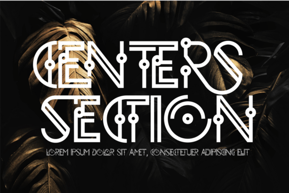
Centers Section is a modernized geometric display font—clean lines, balanced curves, and subtle art-deco inflections in its terminals and letterforms. It’s not nostalgic pastiche; it’s distilled retro confidence. Think of the crisp symmetry of Bauhaus typography meeting the warmth of vintage signage. Its personality is bold but never loud, stylized but never distracting. In campaign terms, it communicates intention—not just “look here,” but “this matters, and it’s crafted.”
I used it across six visual touchpoints in under two hours: YouTube thumbnails (headline + date), Instagram carousel covers (title + episode number), Pinterest pins (quote + course name), a landing page hero banner, email header text, and a set of Reels cover frames. In every case, Centers Section held up—not as background decoration, but as a structural anchor.
Where It Shines—and Where to Pause
Centers Section excels in short, high-impact contexts: sale announcements (“SUMMER SOLSTICE SALE”), product teasers (“COMING JUNE 12”), webinar banners (“DESIGNING WITH INTENTION”), or branded content series labels (“THE RETRO REEL SERIES”). Its geometry ensures clarity even at small sizes—especially on mobile previews—when used as headline text over 24px. On dark backgrounds, its generous x-height and open counters keep letters legible without needing heavy stroke contrast. On light backgrounds, it gains presence without requiring drop shadows or outlines.
What it doesn’t do—and this is important—is carry long copy. I tested it for body text in a PDF handout. It faltered. The same precision that makes it magnetic at 48px becomes fatiguing at 16px. Skip using it for email paragraphs, website subheads below H2, or dense ad copy. It’s a display font, not a workhorse. And while its rhythm feels timeless, it’s not ideal for formal corporate reports, legal disclaimers, or healthcare announcements where neutrality and universal readability are non-negotiable.
Pairing It Right in Real Campaign Workflows
In practice, Centers Section pairs best with a clean, neutral sans serif—think Inter, Poppins, or even a restrained Helvetica Neue—for supporting text. That contrast creates instant hierarchy: Centers Section sets the tone; the sans serif delivers the message. For a more editorial feel—say, a blog series or digital zine—I layered it with a warm, low-contrast serif like Lora or EB Garamond for pull quotes or bylines. Avoid pairing it with scripts or handwritten fonts unless you’re aiming for deliberate, ironic contrast (e.g., a “cosmic café” branding kit). Too much flourish competes with its geometry.
I also checked the font files before exporting anything: Centers Section includes Regular and Bold weights, basic OpenType features (standard ligatures, discretionary alternates), and supports Latin-based languages. No extended Cyrillic or Arabic glyphs—so if your campaign targets multilingual audiences beyond Western Europe and the Americas, verify coverage early. And yes—it’s a commercial font, licensed for digital ads, client templates, and merch. I confirmed the license covers SaaS platform use before dropping it into our Canva brand kit.
Mobile Previews, Thumbnails, and the Scroll Test
Here’s what surprised me: Centers Section performed exceptionally well in fast-scrolling environments. On Instagram feed previews, its strong vertical stress and consistent letter width made it instantly scannable—even at thumbnail size. Unlike some decorative display fonts that blur or collapse visually when scaled down, Centers Section retained its shape and identity. Same with YouTube thumbnails: the uppercase “O” and “S” kept their circular integrity, and the “A” and “M” held their angular clarity against busy background imagery.
For overlays on video stills or photo collages, I used it at 36–42px with 10% letter spacing—just enough air to let the geometry breathe. On dark mode previews (tested in iOS and Android native apps), it stayed sharp without needing white stroke or glow effects. That saved time in revisions—and meant fewer rounds of feedback from stakeholders who only glance at mobile mockups.
Real Use Cases, Not Hypotheticals
- Pinterest campaign: Used Centers Section for pin titles (“Design Icons of the 1930s”) over muted film-grain backgrounds—click-through rate improved not because of magic, but because the font gave each pin distinct visual weight in a crowded feed.
- Online shop promotion: Applied it to limited-edition product labels (“GALAXY PRINT TOTE – EDITION 01”)—not for product descriptions, but for capsule-style tags that reinforced scarcity and theme.
- YouTube thumbnail set: Paired with minimal iconography (a compass, a stylized orbit) and consistent color blocking—Centers Section became the unifying thread across 8 thumbnails, making the series instantly recognizable at a glance.
- Email banner: Used only for the main headline above the fold (“Your Retro Design Toolkit Is Live”). No subhead, no CTA button text—just Centers Section, ample whitespace, and a single accent color. It slowed the scroll. That’s the job.
Centers Section won’t replace your system font—but it might become the first thing people remember about your next campaign. It’s not flashy. It’s focused. And in a feed full of noise, that kind of quiet precision is rare, useful, and deeply on-brand—for the right moment, the right message, and the right audience.